UX Design Revision
Increase the game download conversion rate by updating the old version.

My Role
Research, UI/UX Design, User Testing
Tools
Sketch, Principle, Premiere, After Effects
Duration
Mar 2023 - May 2023
Challenges
Based on my research, there are mainly three problems of the products:
Users are confused about where to download game and are getting lost in clutter pages
Insufficient search guidance confuses users.
Inadequate game management insights.
Objective
Design an efficient and intuitive flow that allows users understand how to search content easily and help them get game downloading more seamlessly.
185%
Screen Efficiency Boost
171%
User Satisfication Boost
10
User Studies
Current User Journey
Research shows users seek better experiences in search, host, and gaming systems.Main revision focus: optimize system structure through a deep, systematic enhancement approach.
PROBLEMS
Based on research and my analysis, there are main three problems.
Here are three cases of how I use redesign to solve the problems through balancing the needs of business and users:
Case 1
Increase conversation rate by redesigning the game downloading process
PROBLEMS
Users struggle to download games from videos due to confusing processes and unclear guidance in the game hub. Limited search and download instructions increase user effort and cost.
Challenge: Balancing updates between Douyu's new game center and established live streaming.
Users require time and resources to learn how to use new features, which are not integrated with the old system, necessitating multiple steps for successful game downloads.
SOLUTION
Simplified the user journey by eliminating unnecessary steps and adding clarifying tags to increase game download conversions from video views. Integrated activities across systems on the user center page to boost user engagement and retention in the new game service.
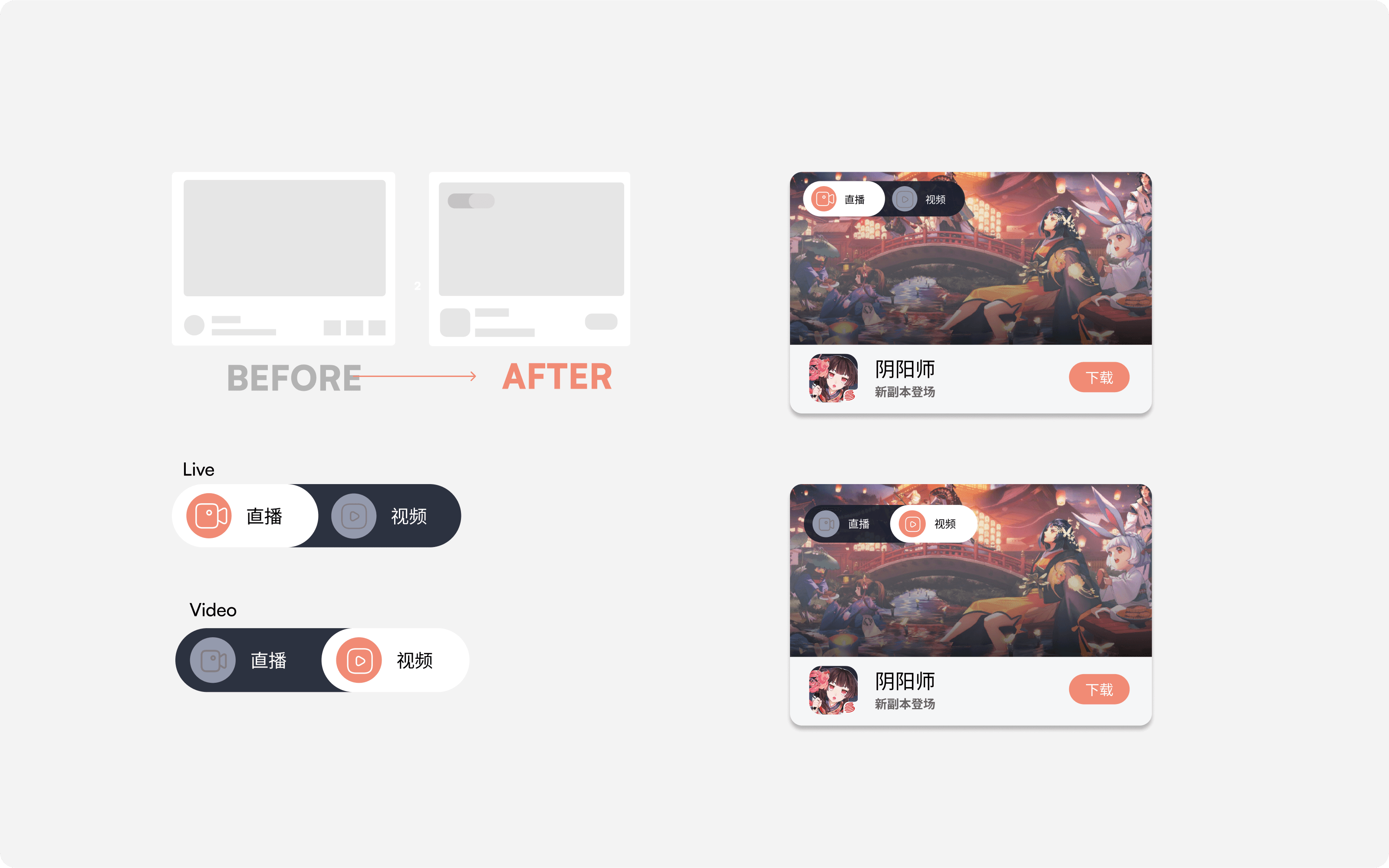
Enable direct game downloads from video pages
Position game download features beneath related videos to streamline user downloads and extend user engagement pathways.
Implement tag hints to distinguish between video types
Implement tags on videos to clarify whether content is live or pre-recorded, aiding user decision-making.
Establish trendy and search zones for enhanced navigation
Remove inefficient waterfall layouts and optimize visual organization to meet targeted search needs and curate games for casual browsers.
Case 2
redesign searching experience to reduce the dropout rate
PROBLEMS
Current search page too simplistic to guide users or meet their growing needs.
Finding quality content, understanding trends, and managing subscriptions are complex and challenging, leading to user drop-off.
SOLUTION
Reduced decision friction and boosted confidence in downloading games by streamlining the user journey, removing unnecessary steps, and integrating tags and system activities to enhance user engagement and time spent on new gaming services.
Take in Everything
in a Glance
Adapted search functionality to include historical data, discovery features, and trending recommendations.
Enhanced Search Hints
Enhanced user efficiency in accessing games and information by introducing novel hierarchical distributions and choosing the most effective plan.
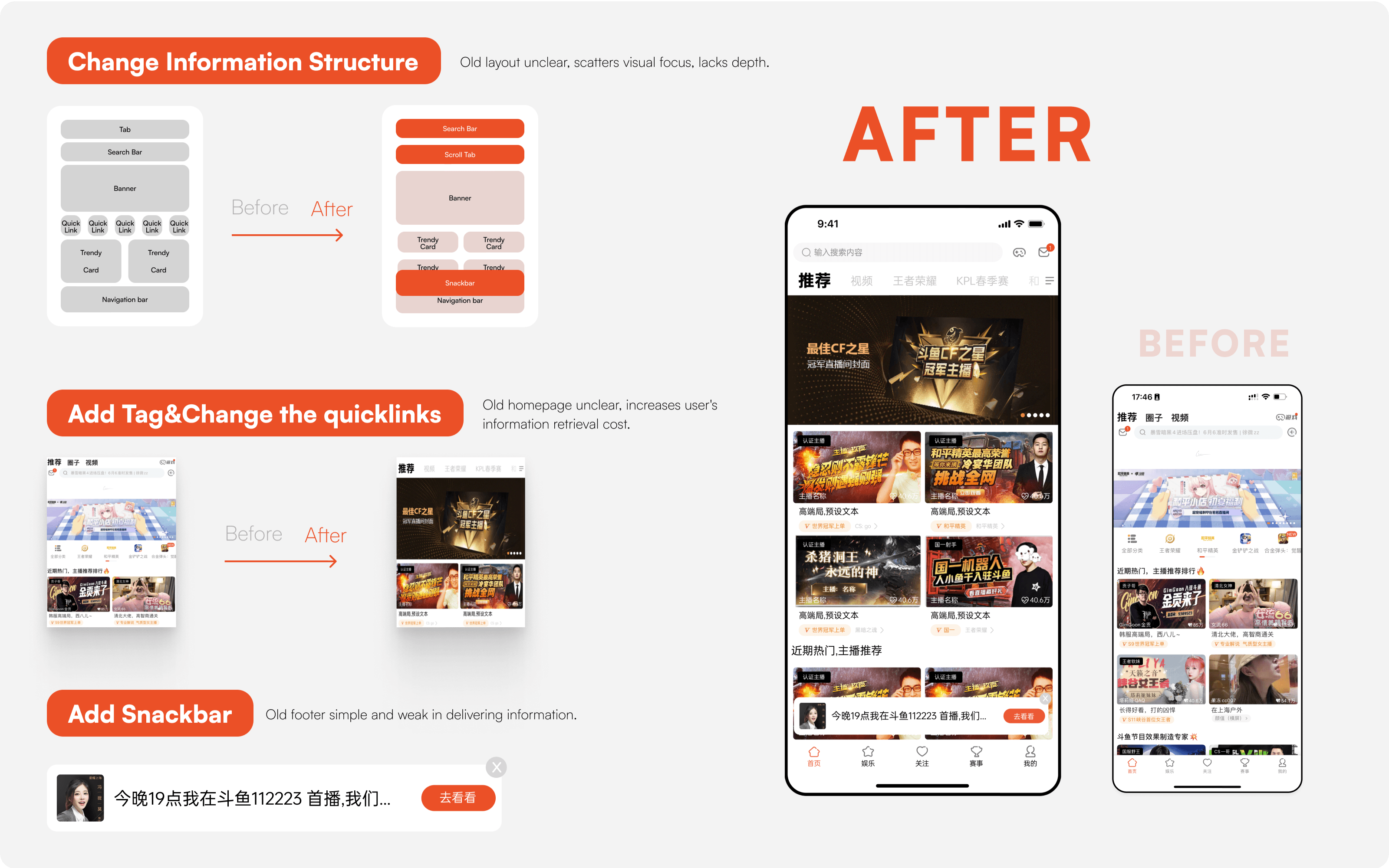
Redesigned Homepage
Boosted screen utilization and navigational ease by optimizing layout, applying the proximity principle for clarity, and centralizing key user-focused information.
Streamlined Live Subscription
Improved screen efficiency and user experience by minimizing whitespace, clarifying content organization, and introducing user-centric notifications at the screen’s bottom.
Case 3
Visualize Data - Enhancing User Comprehension for Gaming Business Decisions
PROBLEMS
Poor integration of events, games, and live activities
Lacks visual gift claiming and live event linkage.
Limited activity information and lacking guidance.
SOLUTION
Adjusted activity ratio, implemented grid design for intuitive progress visualization
Improve the Information Structure: Divided this page into Four Sections, Basic Information;Frequent Operations: Centralized in user center to cut interaction time; Core Features: Merged with diamond area using icons for faster decisions; Information Structure: Bottom layout with card content.
Enhance Profile and Boost Engagement
Through diverse data displays, categorized activity cards, and ratio settings, users intuitively grasp activity progress. Varied card colors and icons enhance user engagement.
User Testing
A set of quantitative data points used to measure, compare, and track the user experience of Douyu app over time.
Primary Flow & Features:
Open app
View live streamer status on 'Following'
Search
View Game Live
Download Game
场景式任务卡片测试
场景式任务卡片测试
Content Search
Game Download
Scenario
Tasks
Outcome
Feedback
Profile: 25 years old, avid gamer, frequently watches game live streams on Douyu, always seeking latest game updates and events.
Scenario: Just off work, wants to find new game events on Douyu and check if any followed live streamers are online.
Open Douyu App
Complete an event task
Check live streamer status on 'Following' page
Search for latest game events
View scheduled games in Game Center's profile.
Achieved
Achieved after comms
Fail
Satisfied with task completion difficulty
Very Disagree
Disagree
Normal
Agree
Satisfied with the time taken
Very Disagree
Disagree
Normal
Agree
Scenario
Tasks
Outcome
Feedback
Profile: 28 years old, occasional gamer, enjoys browsing game live streams on Douyu.
Scenario: Day off, opens Douyu to find interesting live streamers and check new game pre-registrations.
Open Douyu App
Browse homepage for engaging live content
Check live streamer status on 'Following' page
Search for specific live streamers or games
View scheduled games in Game Center's profile.
Achieved
Achieved after comms
Fail
Satisfied with task completion difficulty
Very Disagree
Disagree
Normal
Agree
Satisfied with the time taken
Very Disagree
Disagree
Normal
Agree
Scenario-based Task Card Test:
5.2
7.2
8.6
Medium
Great
Awesome
After
User Experience Metrics
Measure user experience
Usability Assessment of Product Updates
Scoring & Analysis:
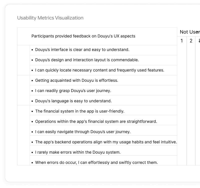
Each user's score was averaged to produce a collective user score. The final usability score was derived by weighting the averaged user scores by 60% and the expert scores by 40%.
Conducted a usability evaluation involving 8 existing product users and 4 UX experts. Post-experience, participants completed a Likert-scale questionnaire. Usability metrics assessed user satisfaction and efficiency.
Normal
Before
4.36
7.49
Review Summary
The whole review of this iteration
Revision Summary: In this school case study, I spearheaded a holistic UX overhaul for Douyu. Key areas of improvement included homepage navigation, visual design, game center, and leaderboards to meet diverse user needs.
Redesign Insights: The redesign stemmed from user research, highlighting pain points during usage. Thus, adjustments were made from a user-centric viewpoint.
User Segmentation: I identified two primary users: goal-oriented and experience-oriented. The former seeks quick results, while the latter values overall experience. Search functionalities were streamlined for the goal-oriented, and for the experience-driven users, visuals and discovery elements were enhanced.
Conclusion: Throughout the redesign, our focus remained user-centric. The outcomes have positively impacted users, emphasizing the importance of user feedback in product enhancements.
Hire Di Chai


