Finetech App
Financial Goal Manifestation App
Manifest your early retirement goals as easily as a breeze.


My Role
Research, UI/UX Design, User Testing
Tools
Sketch, Principle, Premiere, After Effects
Duration
Mar 2022 - May 2023
Overview
"Breeze" offers a refreshing approach to achieving Financial Independence, Retire Early (FIRE), a lifestyle that is becoming a beacon for young people who wish to escape the confines of traditional work and societal norms. Designed with the modern digital shift in mind, Breeze aligns with young individuals' desire for a life that is both affluent and autonomous.
The platform introduces a manifesting approach to financial planning, focusing not on the rigors of saving but on the power of positive belief and self-affirmation. Breeze provides a transformative experience, turning the pursuit of FIRE from a path of scarcity to one of abundance and self-fulfillment, ensuring users feel both blessed and loved throughout their financial journey.
85%
Usability
3
Main Features
87%
User Satisfiction

F.I.R.E is not an easy thing to do
Many aspiring to achieve Financial Independence, Retire Early (FIRE) are struggling with unsustainable strategies like extreme frugality, leading to burnout, depression, and a sense of failure. This widespread struggle underscores the urgent need for more viable and supportive approaches to achieving financial independence.
Solution
A new platform that allows users to utilize a vision board and manifest their own dreams while simultaneously accumulating wealth knowledge.
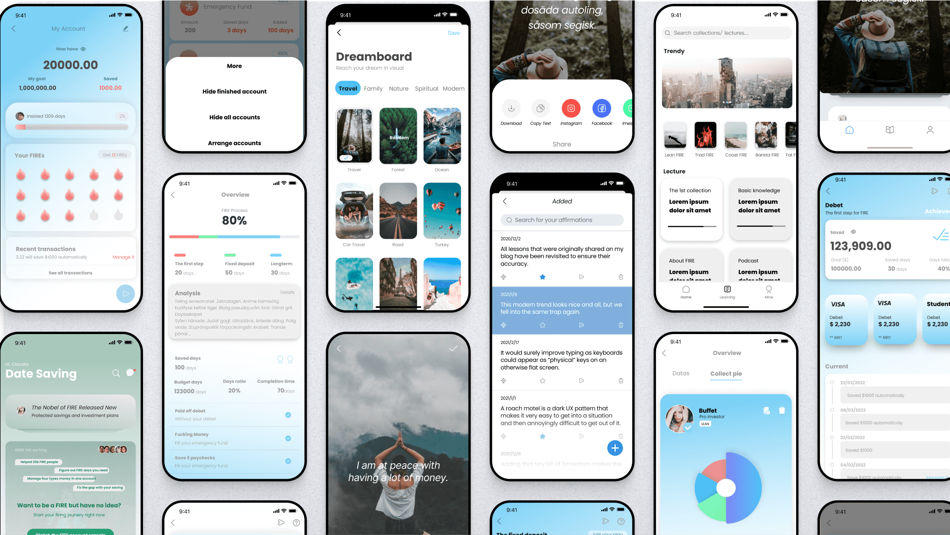

Increased Mindfulness
Be aware of your emotional fluctuations each time you strive to realize a financial dream.
Do you often feel dejected because your savings goals seem out of reach? Allow me to introduce you to the power of positive psychology. Through affirmations, we can shift your perspective and enhance your journey.

Self-Fulfillment
Find the most personal growth from achieving financial goals.
Utilizing blockchain technology ensures the transparency and traceability of each donation.

Actionable Insights
Receive tailored financial advice on how to save money more efficiently
The App allows for the systematic explanation of wealth knowledge, helping people approach their ideal lives step by step.

Visual Progress Display
Witness how your aspirations move closer to reality.
Do you often feel overwhelmed by managing multiple accounts? I'm here to assist you in instantly reviewing your account's status.
HOW WE GET THERE
A CRISIS OF CONFIDENCE IN ECONOMIC DOWNTURN
Young People Doubt the Possibility of Early Retirement, Finding the Process Too Painful
To gather more nuanced perspectives, I interviewed numerous Reddit users who believe that achieving FIRE currently seems too difficult and inherently painful. They also feel overwhelmed by the extensive knowledge required, viewing it as a daunting and massive undertaking. They are unsure where to even begin.

DESIGN SPRINT 1
With the initial needs from users and the research findings from online resources. We started to quickly design and test with our initial concept.
User Research

User Segmentation

Competitive Analysis
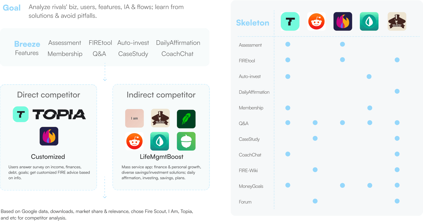
Design Decision
Based on my research, I've decided to design three main features for the app:
Manifest: Utilize a vision board to help users visualize their goals and provide affirmations to boost their confidence and motivation.
Auto Investment: Implement a one-click follow-invest feature to reduce the learning burden for users, making investment more accessible and less intimidating.
Systematic Financial Academy: Offer a structured educational platform to systematically educate users on financial matters, empowering them with the knowledge needed to make informed decisions.
Version 1


Key-findings in User Testing
The process is very unclear.
Users thought it was a social media app.
The manifest feature is too weak.
The investment feature is incomprehensible.
DESIGN SPRINT 2
The second design sprint aims to:
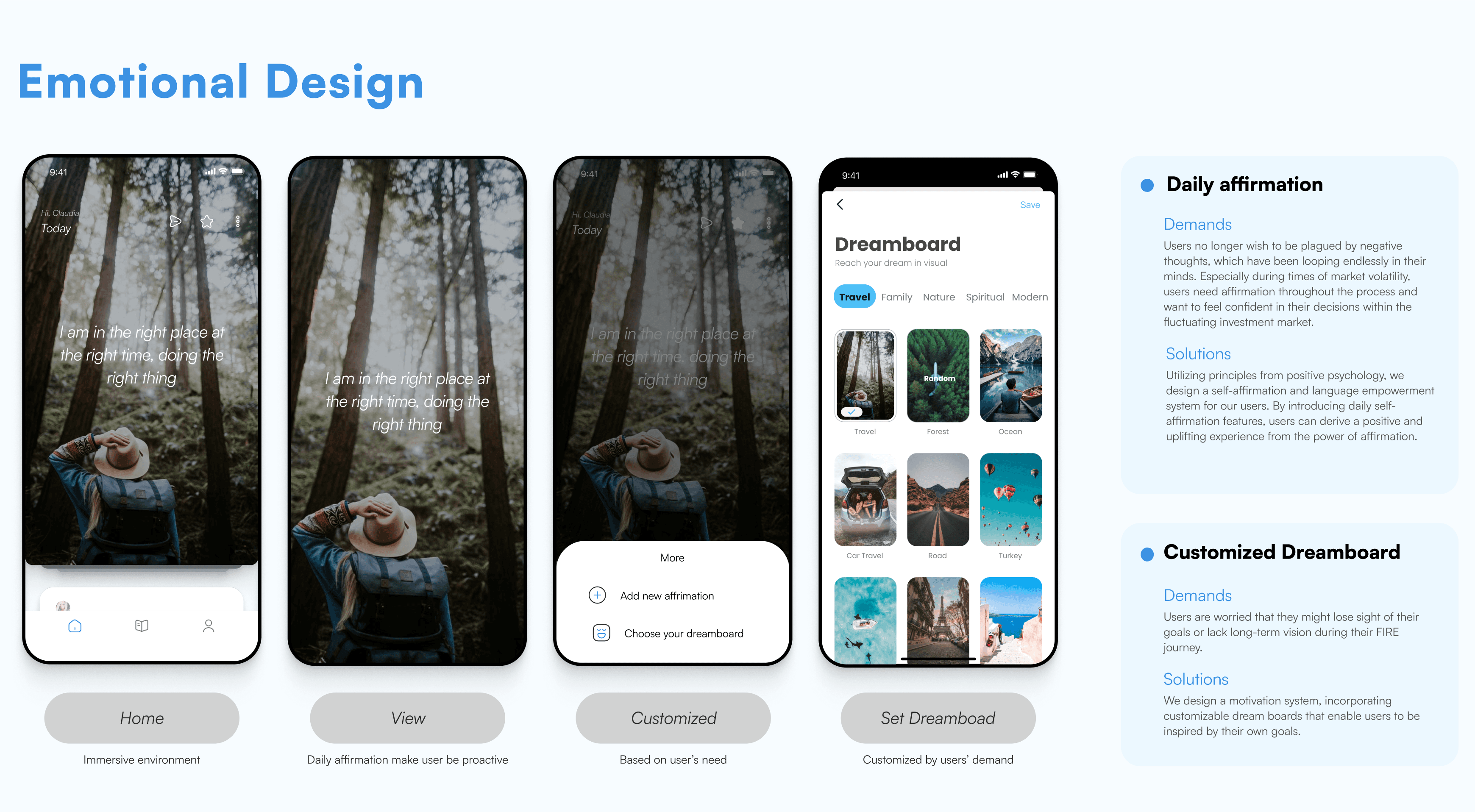
Redesign the Manifest Affirmation Feature: Integrate a vision board to enhance the manifestation process, allowing users to visually organize and affirm their goals more effectively.
Optimize the Visual Display of Investment Features: Improve the clarity and user-friendliness of the investment interface to ensure it is understandable and engaging for users.
Streamline the Financial Education Process: Make the learning system more systematic and accessible, simplifying the acquisition of financial knowledge and making it easier for users to learn and apply financial concepts.
Therefore, we've integrated the vision board into the 'Affirmation' feature, enhanced its visual and interactive elements for stronger affirmations, and optimized the investment function for clearer understanding. Additionally, we've streamlined the financial education process to make learning more systematic and accessible.
Design Process


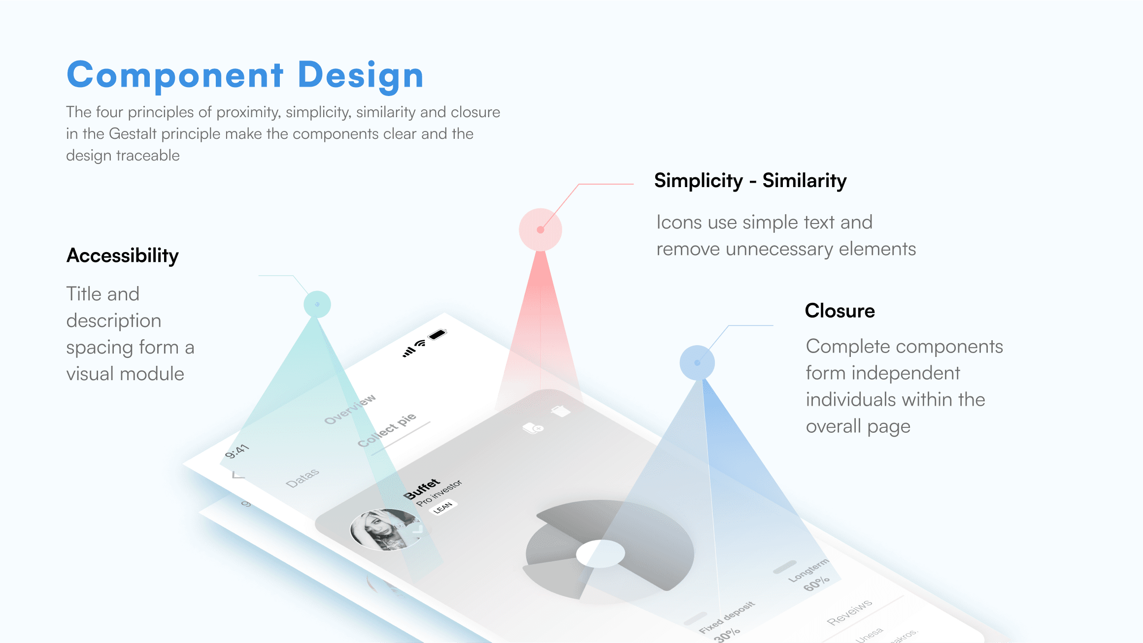

Final Design
This update addresses several key issues:
Clarified Vision Board Experience: We've enhanced the clarity of the vision board experience, making the goals and progress visually distinct and easy to understand.
Added Tags for User Comprehension: We introduced tags to help users easily identify and navigate through different posts, improving their overall app navigation and usability.
Layered Visual Hierarchy for Investments: We've employed a tiered visual hierarchy that makes the investment and financial planning aspects more intuitive and visually appealing.
Designed Smoother Components for Enhanced Experience: We've crafted different components to make the user interface smoother and more enjoyable, ensuring a seamless and engaging user experience.
Based on user feedback and research findings, we implemented a vision board on our main page and added an educational resource center to offer more in-depth insights about financial strategies and goals.
Final Screens

What I learned
Considerations for Visualizing Fintech Needs
This was my first crack at designing a fintech app for a big audience. It really made me think about how tech could change the way people work and interact, and even their basic thinking. For example, I considered how using affirmations could actually make users happier, instead of just throwing them in for looks.
I was set on keeping the core features of the app without getting sidetracked by unnecessary fintech gimmicks. Knowing that folks often get too wrapped up in money matters and miss what they really need, I aimed to make sure each feature was genuinely useful. I wanted users to find some peace while using the app, which is why it’s called "Breeze."
With our new user base in mind, I went for simpler, more familiar interaction designs. I think it’s a good move for redesigns and I’m keen to dig deeper into this area and chat more about it.

Cultivation and Capture of New Ideas
I recognized the significance of seizing spontaneous creative insights during interviews. Occasionally, these inspirations strike unexpectedly after extensive contemplation on a subject.
Throughout the project, I diligently recorded every idea that surfaced, irrespective of its quality, using Notion. Meditation provided moments of respite, allowing my thoughts to wander and cultivate fresh perspectives. Later, I'd revisit these ideas, refine them, and some even made their way into the final design. I intend to uphold this practice in my future designs

Di Chai 2024
Hire Di Chai
