Hire Di Chai




Actionable Insights

About Breeze
As more and more young people yearn to break free from the shackles of conventional life, the FIRE lifestyle, popular in Silicon Valley, has gained momentum. This acronym stands for "Financial Independence, Retire Early" - a lifestyle centered around accumulating enough wealth to retire ahead of time and live life on one's own terms. This lifestyle is gaining popularity among younger individuals who are suffering in their jobs, feeling stifled by society, or simply yearning for freedom. However, financial tools on the market still pose complex usage issues. Breeze hopes to be a breath of fresh air, enabling users to embark on this journey with ease and confidence.
Challenge
Research indicates that the FIRE (Financial Independence, Retire Early) community lacks comprehensive knowledge about achieving their financial goals. They require enhanced guidance on managing their financial resources during their long-term financial journey. Specifically, many members feel overwhelmed and are unsure of how to break down their goals, leading some to abandon the journey or experience feelings of isolation.
Solution
Breeze utilizes positive psychology to assist emerging adults in concentrating on their financial goals and better understanding their journey's approach. Based on my user research, this is one of the most crucial financial concepts to grasp. My application motivates users to value daily efforts towards their grand aspirations, offers actionable and tailored insights based on individual goals, and aids in preventing users from abandoning their journey due to negative emotions.
35%
25%
84%

Questionary
01
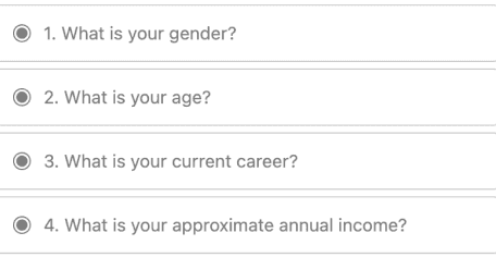
Basic Info
Gender/Age/Career/Income
User Feature:
Aged 25-35, 40% earning over $100k/year, gender ratio of 1:1, over 60% employed in the tech industry, based in Silicon Valley.
Behaviors
Actions/Hobbits/Preferences/Scenario
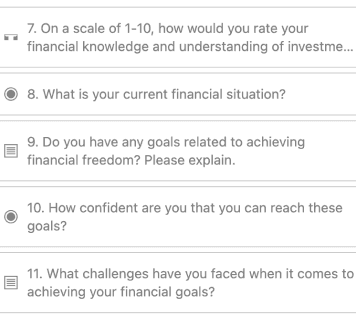
Potential:
Over 80% of users have been exposed to FIRE-related software through various channels, and nearly half have experience searching for or exploring FIRE software.
Attitude
Satisfaction/Needs/Attitude/Attributes
UX issue:
70%+ users unsatisfied with finance products/platforms
Attitude:
Majority seeks FIRE-focused features in new finance apps.
Purpose
Expectations/Needs/Solutions
Painpoint:
80%+ users seek a streamlined, active community, and psychologically soothing FIRE-targeted financial app with improved UX.
Collect user data on demographics, behavior, attitudes, and goals through surveys. Sample size: 80 respondents. To view the questionnaire, click the link: https://blocksurvey.io/survey/p/babdba61-6f4a-4b02-a96c-89499209aa10/r/o
User Interview
02
Goal
Identify user needs and uncover pain points
Questions
1
Name
2
Age
3
Career
4
Income
1
What is your preferred personal finance app?
2
When do you use mobile investment apps?
3
Frequency/duration of financial app use per week? Reasons for choosing mobile apps?
4
Used financial/wealth management apps before? Impressions?
5
Inconveniences faced while using financial apps? Solutions?
6
Have you used Topia for FIRE financial planning? If so, how frequently do you use it?
7
Describe last use of Topia. Thoughts and feelings about the experience?"
8
Topia membership purchase history? Reasons and timing?
9
What’s your worst Topia experience?
10
What aspects of Topia's software do you think need improvement, specifically?
11
Have you used Topia to track and monitor your FIRE progress? How was the experience?
……
User research with interviews for ages 25-35, online/offline methods, 6 males & 4 females, phone recordings & in-person talks, capturing experiences & needs for precise segmentation.
Problems
03
Too many colors causing distraction and difficulty finding core functions
Painpoint
Homepage lacks achievement sense after accumulation
Simplistic homepage lacks task rewards, poor user experience
Bottom-located common functions cause accidental clicks
Overemphasized core functions cause distraction, poor experience.
Lacks community and articles, hindering beginner learning and goal achievement
Painpoint
Require separate scheduling and interface switching.
Coach view redirects to webpage, inconvenient comparison
Separate learning and recording areas hinder user engagement.
Low page efficiency, difficult to differentiate coach pros and cons.
Easy and continuous recording important, but Topia has poor user retention.
Painpoint
Lack of shareability reduces sense of accomplishment.
Manual data entry for finances is frustrating, discouraging.
No task breakdown, poor user experience
Complex accounting process reduces user motivation to record.
Weak app-to-reality connection perception leads to low coaching service purchase willingness.
Painpoint
No app recognition, no life improvement
Users trust bloggers on other platforms more.
App lacks emotional value and necessity.
No community links beyond workshops, reduces engagement.
User Personas
04
Behavior

Age: 25-35
Gender: Male or Female
Occupation: IT person or freelancer
Tech savviness: Comfortable using technology
Goal: Share, earn and feel good, FIRE with one-tap
Our users are finance enthusiasts seeking an easy path to FIRE, passionate about financial freedom and work-life balance. They want a simple way to track progress, learn investment skills, connect with like-minded people, and boost their FIRE savings."

User Segmentation
04
Type
Lucy
34 years old/HR
Career exhaustion, desire to return to nature and pursue passion as a full-time writer
Collaboration
Scenario
Sustained Engagement
Vision
Savings, ROI consideration
Purchasing Power
Behavior
Connect users on FIRE, share experiences, prepare for resignation, aspiring writer.
Goal
Prefer expressing opinions and helping others on Reddit over using simplistic recording software; find Excel to be a smoother alternative.
Pain point
Expert User
Type
Eric
27 years old/ IT
Desires economic freedom as a digital nomad, dislikes Silicon Valley politics.
Behavior
Efficiently track spreadsheets & learn investing, beginner resources, quick note-taking amidst busy schedules.
Goal
Tedious manual recording, forget to open app, overwhelmed by learning curve. Unclear where to start.
FIRE Novice


Log& learn
Scenario
Expand Usage
Vision
Low Purchase Intent
Purchasing Power
Pain point

User Goal
User Goal
Long-term saving, financial freedom
Share/inquire post-reading/investment.
Behavior
Behavior
Identify FIRE type/plan/save/earn rewards.
Publish/Like.
Painpoint
Painpoint
User forgetfulness, recording process hindrances.
No response, sparse feedback.
#03
SavingsPlan
Simple page actions for immersion; Daily affirmation updates for emotional gratification
Opportunity#03
#04
Post
User-generated account images for communication and discussion.
Opportunity#04
User Goal
User Goal
Long-term saving, financial freedom
Share/inquire post-reading/investment.
Behavior
Behavior
Identify FIRE type/plan/save/earn rewards.
Publish/Like.
Painpoint
Painpoint
User forgetfulness, recording process hindrances.
No response, sparse feedback.
#03
SavingsPlan
Simple page actions for immersion; Daily affirmation updates for emotional gratification
Opportunity#03
#04
Post
User-generated account images for communication and discussion.
Opportunity#04













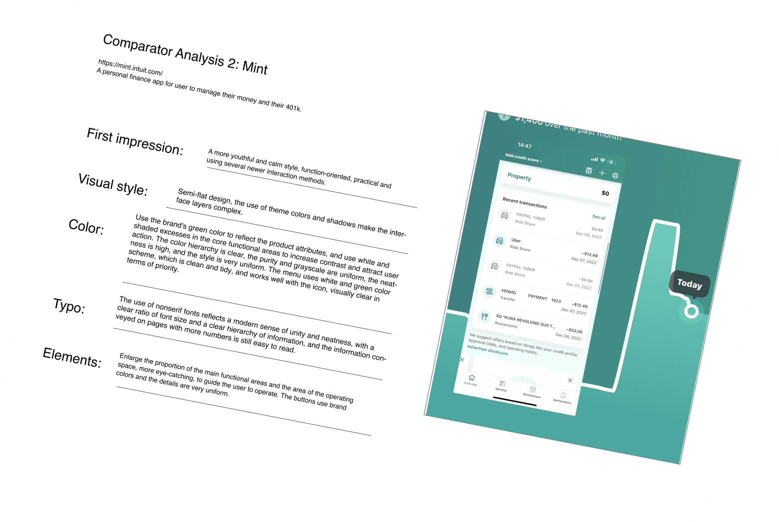

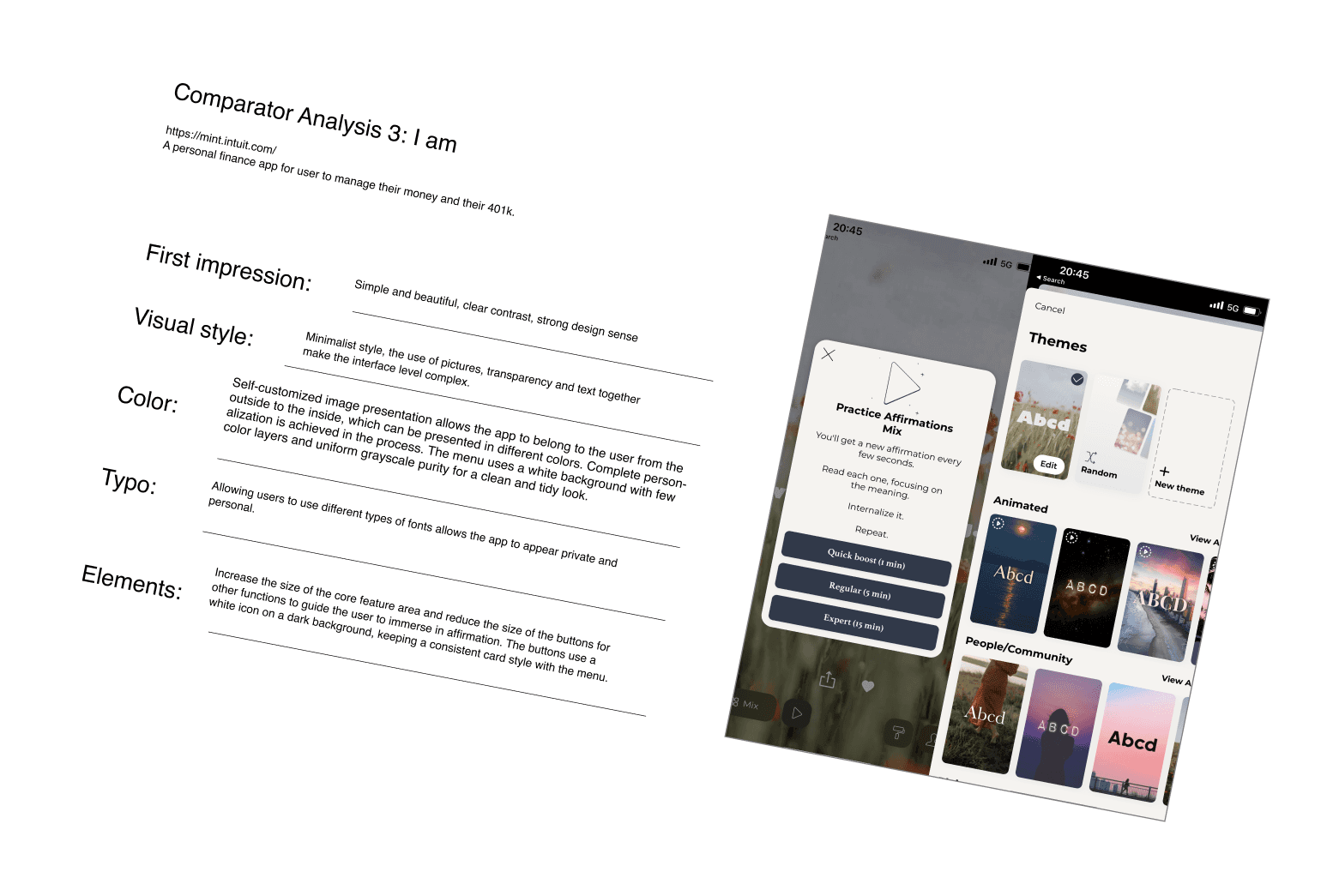


Competitive Analysis
06
Feature
Scope
Find pros/cons, target enhancements.
Wireframe
Skeleton
Analyze layout, hierarchy; identify issues, optimize designs.
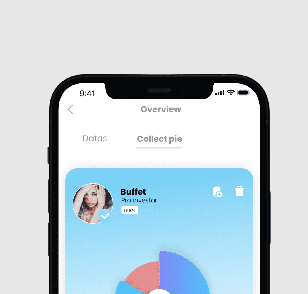
Structural Flow
Structure
Assess IA, workflow; identify pros/cons; make improvements.
Visual
Scope
Analyze competitors' visuals, seek differentiation.

Breeze
Features
Assessment
Direct competitor
Users answer survey on income, finances, debt, goals; get customized FIRE advice based on info.
Customized
Mass service app: finance & personal growth, diverse savings/investment solutions; daily affirmation, investing, savings, plans.
LifeMgmtBoost
Indirect competitor
Auto-invest
FIREtool
DailyAffirmation
CoachChat
FIRE-Wiki
MoneyGoals
Forum
CaseStudy
Q&A
Assessment
Auto-invest
FIREtool
DailyAffirmation
CoachChat
CaseStudy
Q&A
Membership
Membership
Skeleton
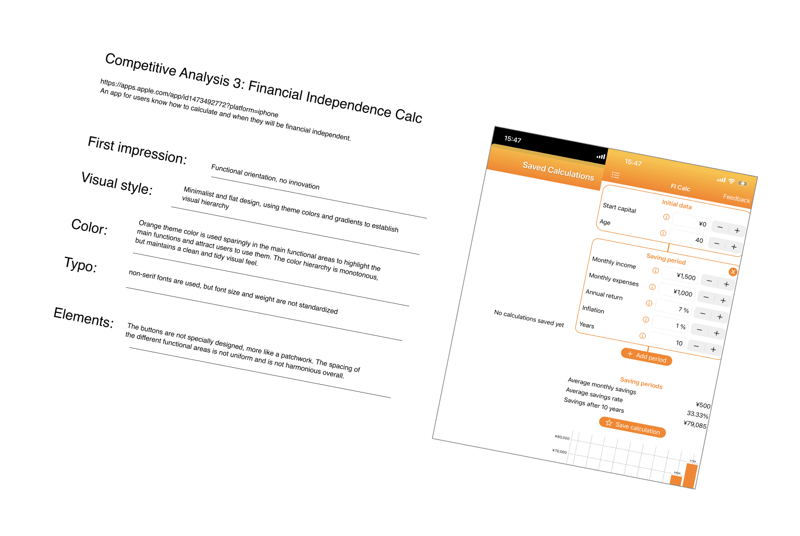
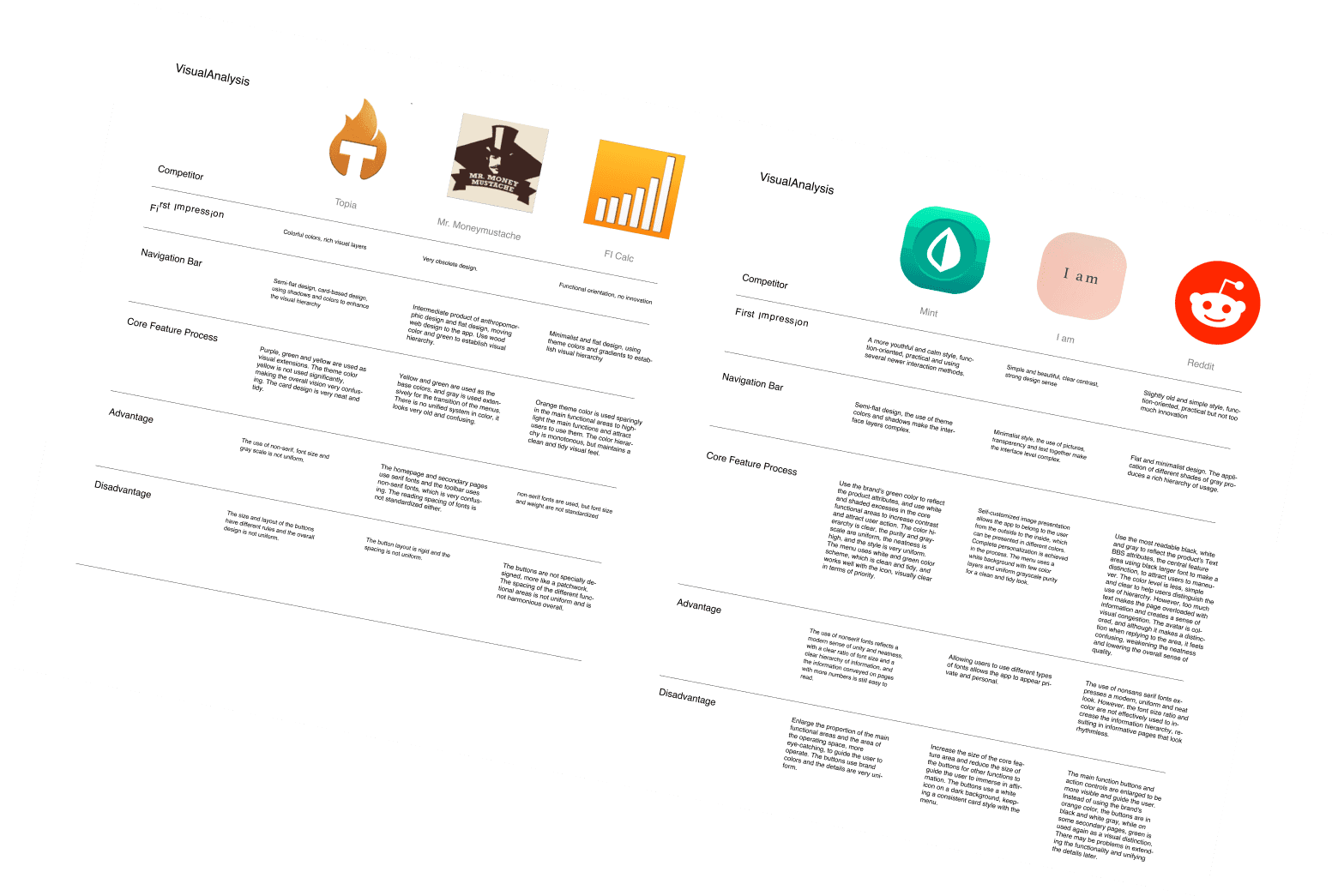
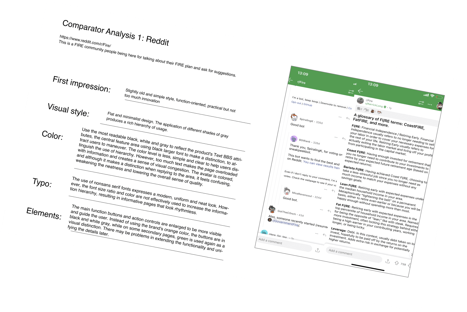
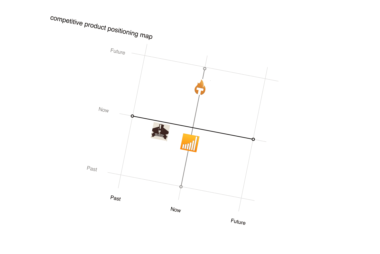
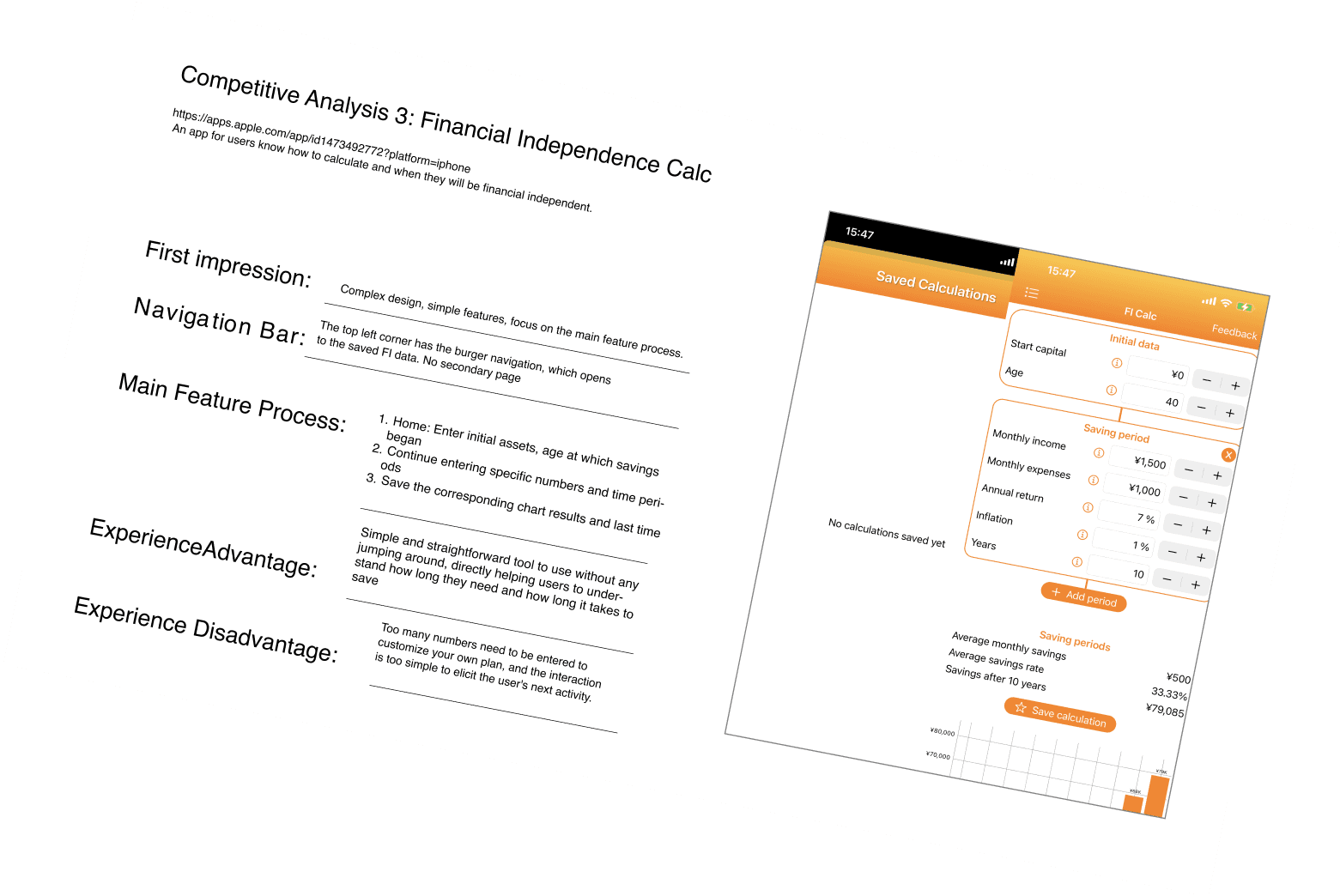
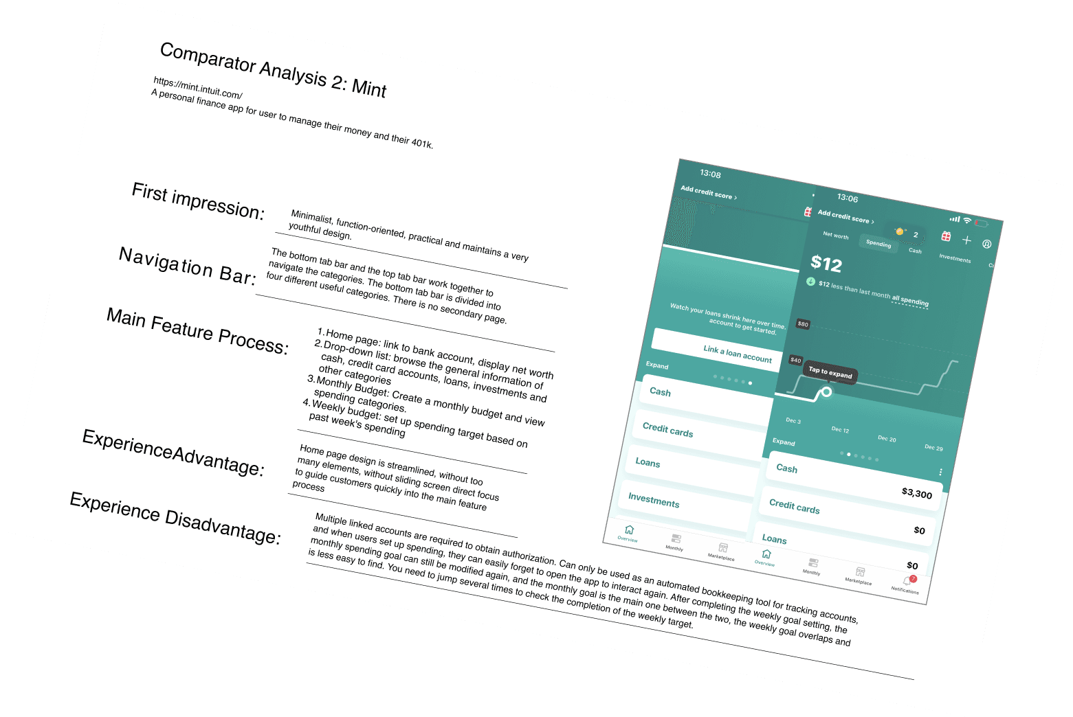
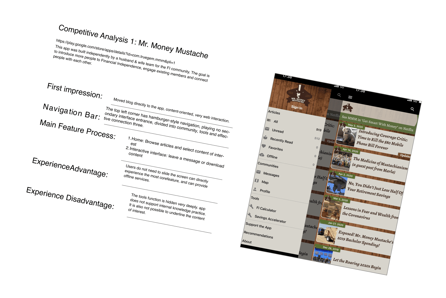
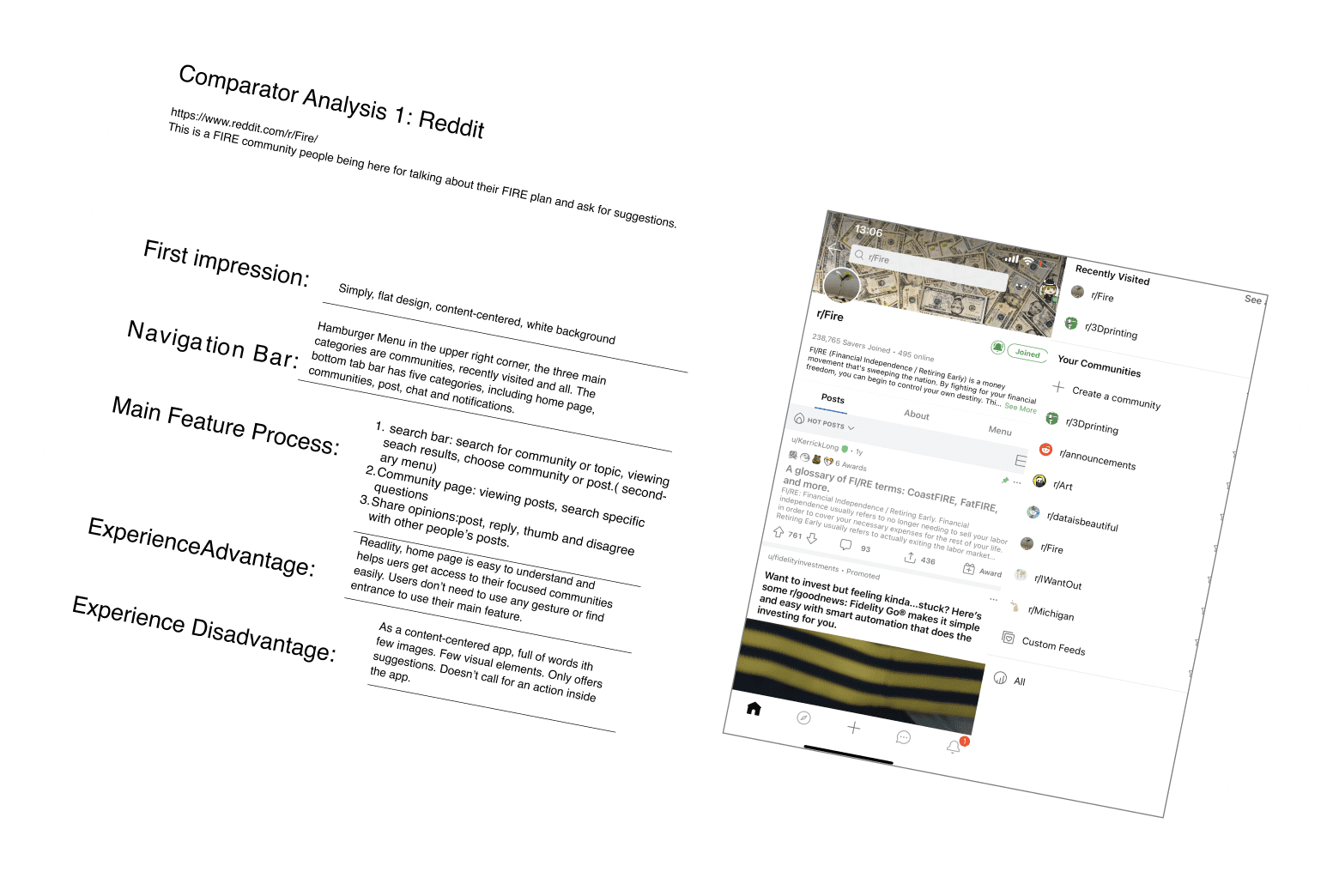
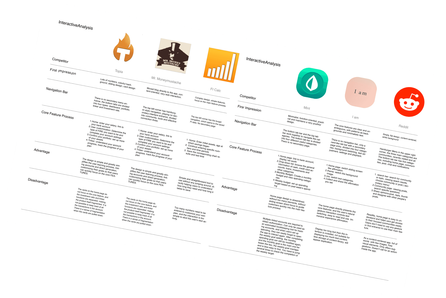
Based on Google data, downloads, market share & relevance, chose Fire Scout, I Am, Topia, and etc for competitor analysis.
Analyze rivals' biz, users, features, IA & flows; learn from solutions & avoid pitfalls.
Goal







Design Guide
07

Keywords
Product Position
Simple/Social/Joy
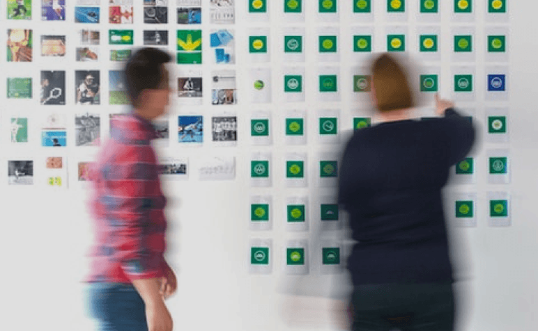
User Interview
Immersive/Relaxed/Easy

Data Analysis
Initiative/Tenacity/Productive


Social


Bonfire/Dance/Walking

Tenacity


Pine/Tree Root/Moss

Relaxed


Blossom/Sky/Diving
Social
Relaxed
Tenacity
Emotional Design
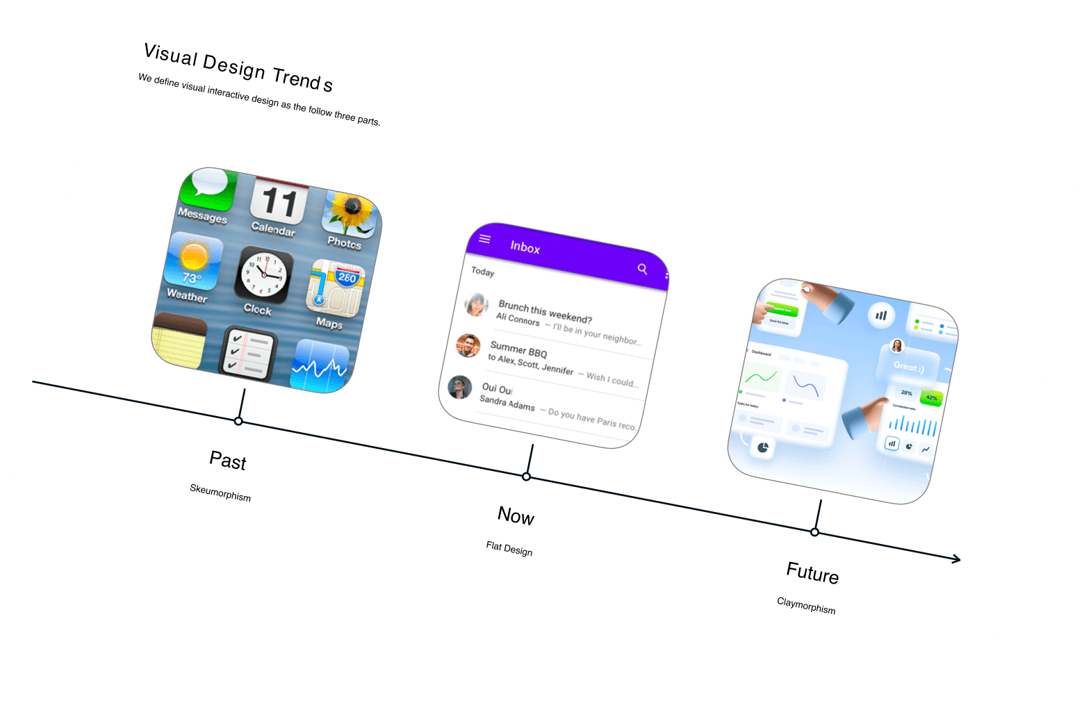
Glassmorphism
Minimalism
Card Design
Personalization

UI Style
Primary Keywords
Free Association


Competitive Analysis
06
Feature
Scope
Find pros/cons, target enhancements.
Wireframe
Skeleton
Analyze layout, hierarchy; identify issues, optimize designs.

Structural Flow
Structure
Assess IA, workflow; identify pros/cons; make improvements.
Visual
Scope
Analyze competitors' visuals, seek differentiation.

Design Guide
05
Poppins
Aa Bb Cc Dd 1234
Aa Bb Cc Dd 1234
#F77C7C
Proactive Red
Wealth Green
Relax Blue
#7CF7A6
#94D7FB
Breeze
Features
Assessment
Direct competitor
Users answer survey on income, finances, debt, goals; get customized FIRE advice based on info.
Customized
Mass service app: finance & personal growth, diverse savings/investment solutions; daily affirmation, investing, savings, plans.
LifeMgmtBoost
Indirect competitor
Auto-invest
FIREtool
DailyAffirmation
CoachChat
FIRE-Wiki
MoneyGoals
Forum
CaseStudy
Q&A
Assessment
Auto-invest
FIREtool
DailyAffirmation
CoachChat
CaseStudy
Q&A
Membership
Membership
Skeleton
Based on Google data, downloads, market share & relevance, chose Fire Scout, I Am, Topia, and etc for competitor analysis.
Analyze rivals' biz, users, features, IA & flows; learn from solutions & avoid pitfalls.
Goal


Design Guide
07

Keywords
Product Position
Simple/Social/Joy

User Interview
Immersive/Relaxed/Easy

Data Analysis
Initiative/Tenacity/Productive


Social


Bonfire/Dance/Walking

Tenacity


Pine/Tree Root/Moss

Relaxed


Blossom/Sky/Diving
Social
Relaxed
Tenacity
Emotional Design
Glassmorphism
Minimalism
Card Design
Personalization

UI Style
Primary Keywords
Free Association
Design Guide
07
Aa
Primary color
Extension color
#94D7FB
Size: 34 32 30 28 24 20
Style: Normal Bold Italic

#94D7FB
Primary color

#F77C7C
Accent color

#7CF7A6
Secondary color
Poppins
Based on user research, the primary target audience is aged between 18-35, with the highest proportion being 25-30 years old. The majority of users are male, predominantly highly educated Silicon Valley male programmers working in the tech industry. The user base in the United States is primarily concentrated in tech-heavy regions, such as California. Therefore, for the product's color scheme, we incorporated trendy elements by selecting images based on product positioning and target keywords. We chose blue as the primary color to represent the tech industry and youthfulness, with red as an accent color. Blue conveys a sense of calmness, technology, and authority while also promoting relaxation and comfort. Green symbolizes rising stock prices, stimulating visual retention. These two colors help users immerse themselves in the flow of using the product.
Brand Voice
Color
Blue is the color of wisdom. Combination of green ( wealth, UX)&red ( proactive, UI)
Typography
Utilize sans-serif Poppins as the main font. For hierarchy and decision-making, contrast text with weight, size, and color. Maintain a minimum 2pt font size difference.
Mood Board
Miyagi-format
The four principles of proximity, simplicity, similarity and closure in the Gestalt principle make the components clear and the design traceable


Icons use simple text and remove unnecessary elements
Simplicity - Similarity
Complete components form independent individuals within the overall page
Closure
Title and description spacing form a visual module
Accessibility
Activity
Card Infos
Goal
Timeline
Amount
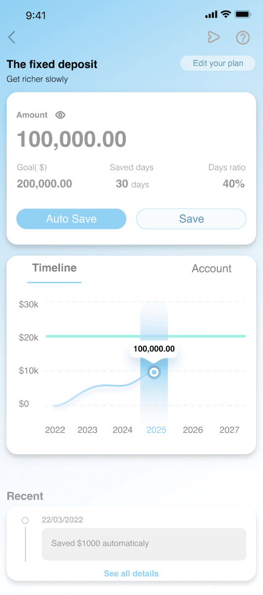
Redesign guidelines.
Utilize cross-analysis to hierarchize train information, facilitating efficient scanning
Apply proximity by integrating containers for timeline, sub-accounts, goal amount, and total savings for ease of reading and comprehension
Eisenhower matrix
Grouping related information
Timeline
Account
Visa **6898
Visa **6898
Visa **3840
Timeline
Account
100,000.00
$30k
$20k
$10k
$0
2027
2026
2025
2024
2023
2022
The Nobel of FIRE Released New
Protected savings and investment plans


Today
Hi, Claudia
Lörem ipsum kaska lurat nekroling. Sektig dosäda autoling, såsom segisk.
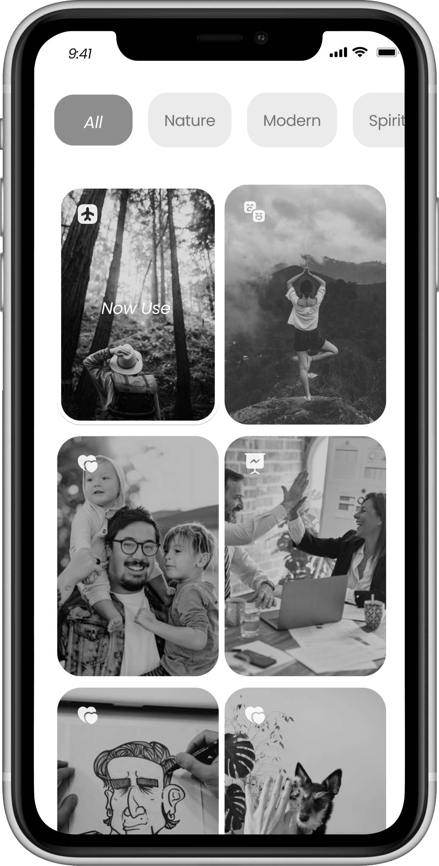
Immersive environment
Home

Lörem ipsum kaska lurat nekroling. Sektig dosäda autoling, såsom segisk.
Daily affirmation make user be proactive
View

Today
Hi, Claudia
Lörem ipsum kaska lurat nekroling. Sektig dosäda autoling, såsom segisk.
The Nobel of FIRE Released New
Protected savings and investment plans

More
Add new affrimation
Choose your dreamboard
Based on user’s need
Customized
Emotional Design
06
Daily affirmation
Customized Dreamboard
Demands
Users no longer wish to be plagued by negative thoughts, which have been looping endlessly in their minds. Especially during times of market volatility, users need affirmation throughout the process and want to feel confident in their decisions within the fluctuating investment market.
Solutions
Utilizing principles from positive psychology, we design a self-affirmation and language empowerment system for our users. By introducing daily self-affirmation features, users can derive a positive and uplifting experience from the power of affirmation.
Demands
Users are worried that they might lose sight of their goals or lack long-term vision during their FIRE journey.
Solutions
We design a motivation system, incorporating customizable dream boards that enable users to be inspired by their own goals.

Customized by users’ demand
Set Dreamboad
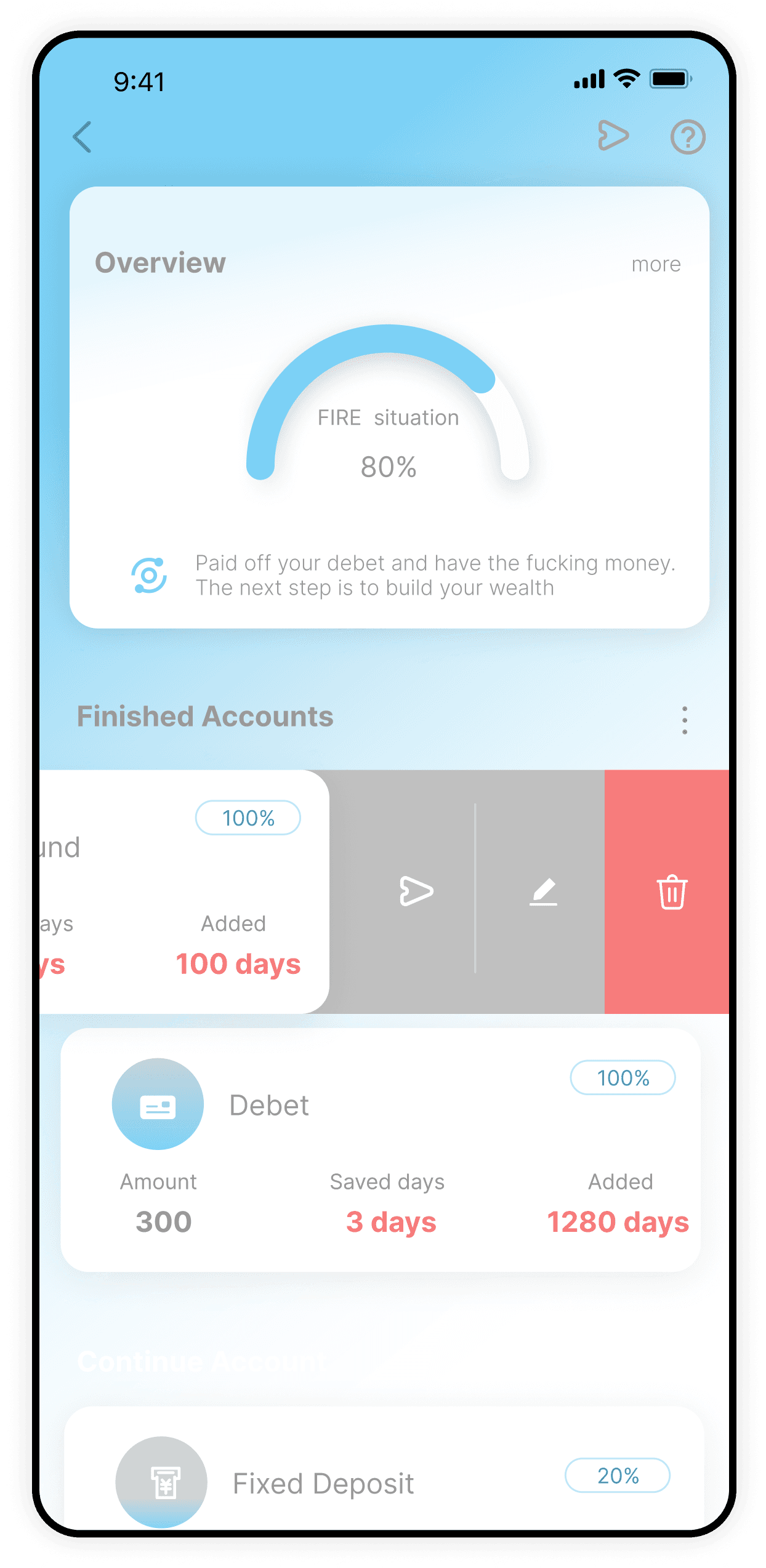
View overall billing information
03 Info
Bottom frame, carrying card content
04 Base
Users can choose between different savings accounts
Basic operation area
02 Portal
Top area:
The top area is more inconvenient to operate, at the top mainly place the cards for viewing
Acceptable area:
The central part is the basic operation area, the core functions such as viewing sliding and adding accounts are concentrated in this area
Bottom area:
Bottom area hand sliding operation is more convenient, the sliding function is placed at the bottom to facilitate user operation
Gather visual focus to highlight content information and improve user operation
01 High-frequency


Difficult
Normal
Easy
Hi-fi Design
07
Advantages: List layout allows for a stable interface structure and clear information hierarchy. Reduce interaction cost and cognitive load
Disadvantages: But the list layout structure is single, and most competitors are this layout, no differentiation, lack of product original features, page information is very little
PlanA
Advantages: List layout allows for a stable interface structure and clear information hierarchy.Provides the best information accessibility, because of the boldly designed segments and visible groups.
Disadvantage: Too many choices and too many colors on the eyes
PlanB
